PureSAF
Two directions for an Istanbul architecture practice.
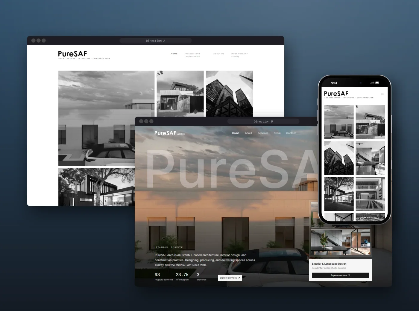
PureSAF is an architecture, interior design and construction group in Başakşehir, Istanbul, working across Türkiye and the Middle East. Three businesses under one name, a Gulf audience reading in two languages, and a portfolio that has to speak before any copy does. We designed and built two complete directions to find out which story the practice should tell.
- Year
- 2026
- Platform
- Web · EN / AR
- Deliverable
- Two built directions
- Market
- Türkiye · Gulf
Role
IA, UX/UI, design system, front-end
Stack
- Next.js 16
- React 19
- Tailwind v4
- shadcn/ui
- Motion
- Vercel
Chapters
/One name, three businesses
The practice
PureSAF designs buildings, builds them, and exports the materials and furniture that go inside them through a separate trade arm. Its clients are private owners and Gulf buyers investing in Türkiye, people who judge an architect by the work first and the words second.
The existing web presence split that story across several sites. The brief was one front door that could hold architecture, interiors, construction and trade without turning into a brochure with ten headings.
Projects delivered
m² designed
Years of practice
Destination countries
Source · Figures supplied by the client from their existing site, pending verification
/Gallery or agency?
The question
Architecture sites usually go one of two ways. The gallery: work first, almost no words, the confidence of a practice that lets its buildings speak. Or the agency: a guided pitch with numbers, services, process and FAQ that answers a buyer's questions before they ask.
Instead of arguing it in a deck, we built both, end to end, on the same stack and the same content model, so the client could click through real pages, on a real phone, and feel the difference.
/Let the buildings speak
Direction A: The gallery
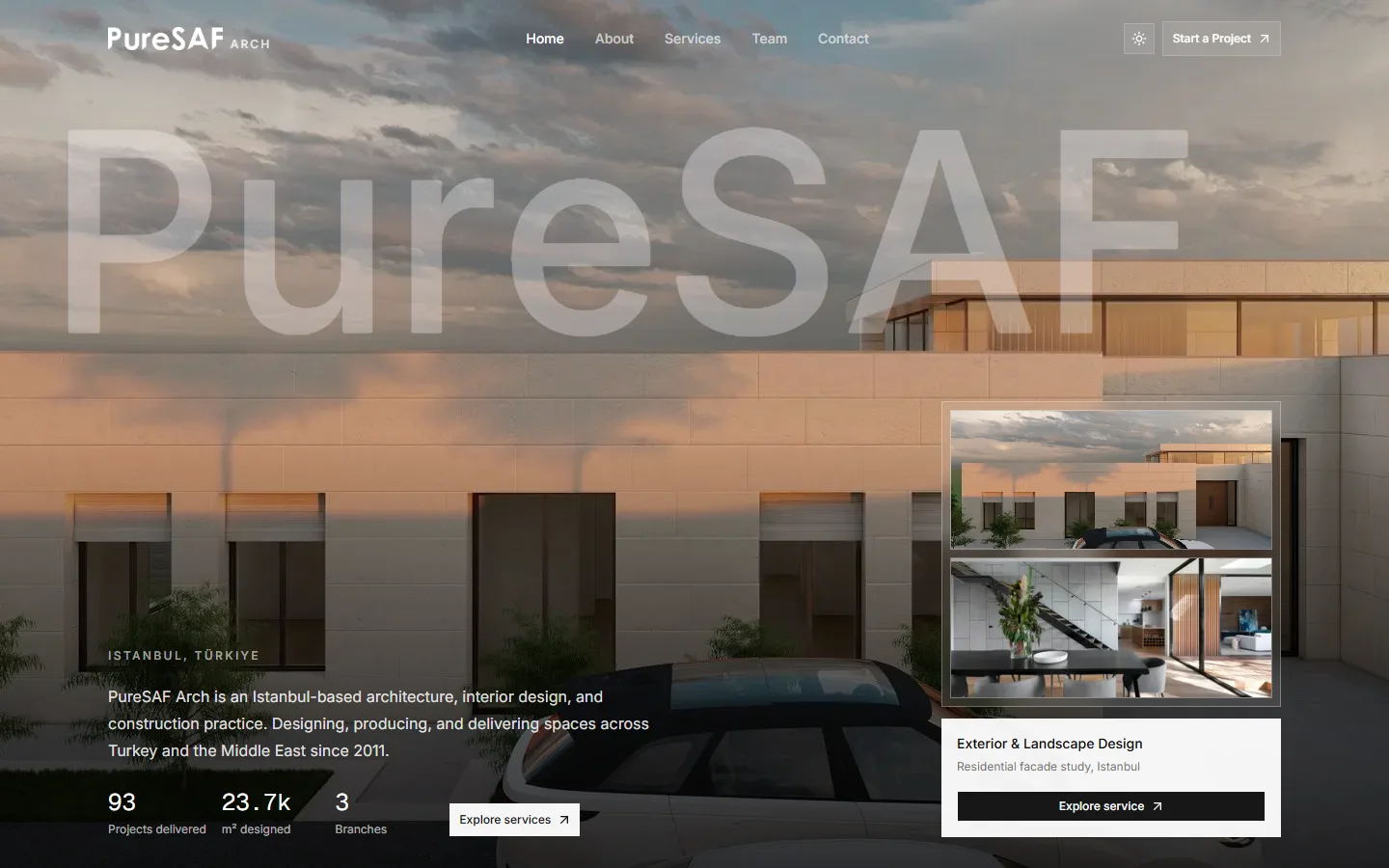
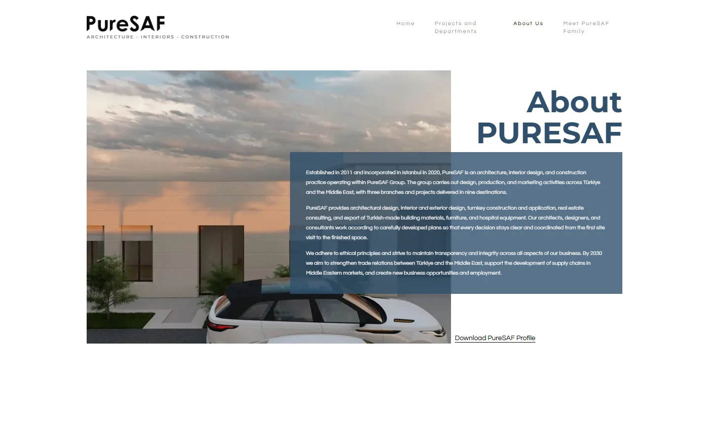
The home page is nothing but work: an eight-cell masonry pattern of mixed tile sizes, rendered in grayscale so the portfolio reads as one body of work, then blooming into colour under the cursor. No hero headline, no slogan.
Every corner is square (radius: 0), the navigation is a whisper of 11px letter-spaced labels, and the type pairs Montserrat headings with Questrial text and a Cormorant Garamond italic reserved for the founder's voice.
/Answer the buyer's questions
Direction B: The agency
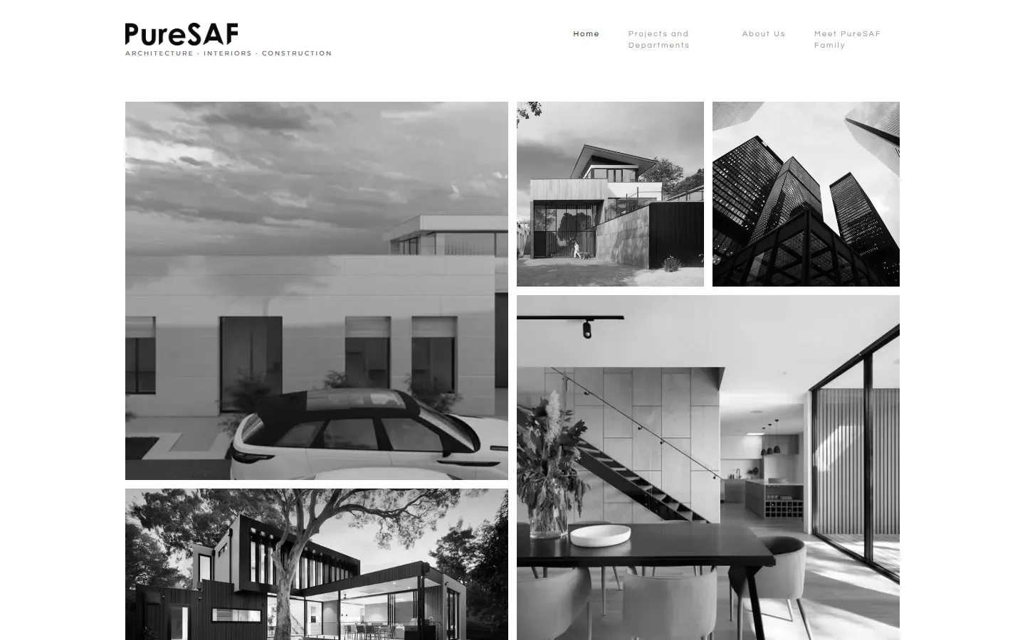
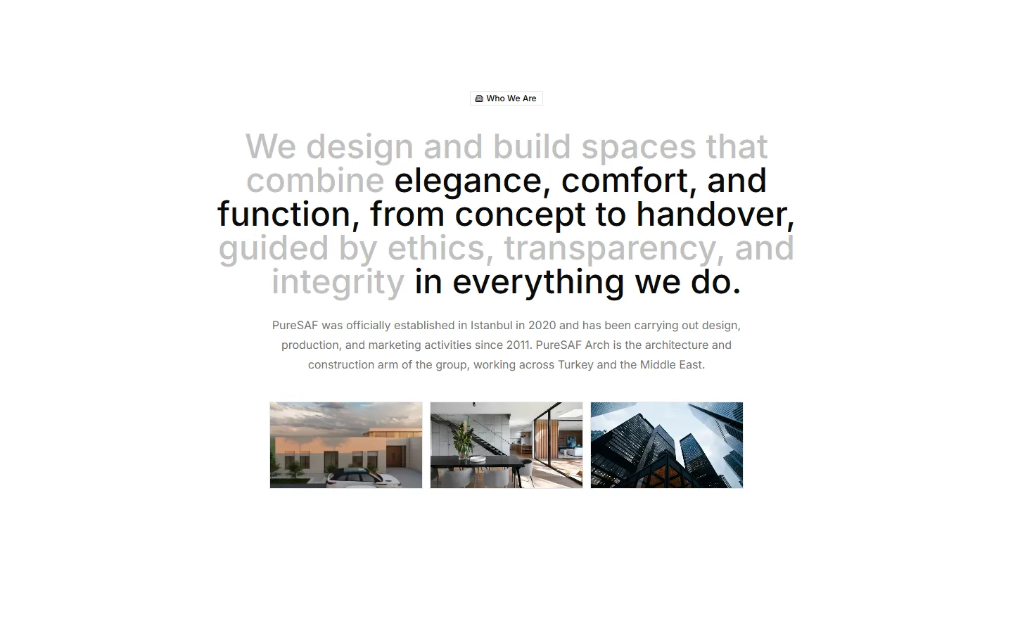
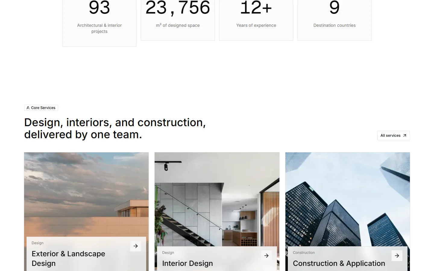
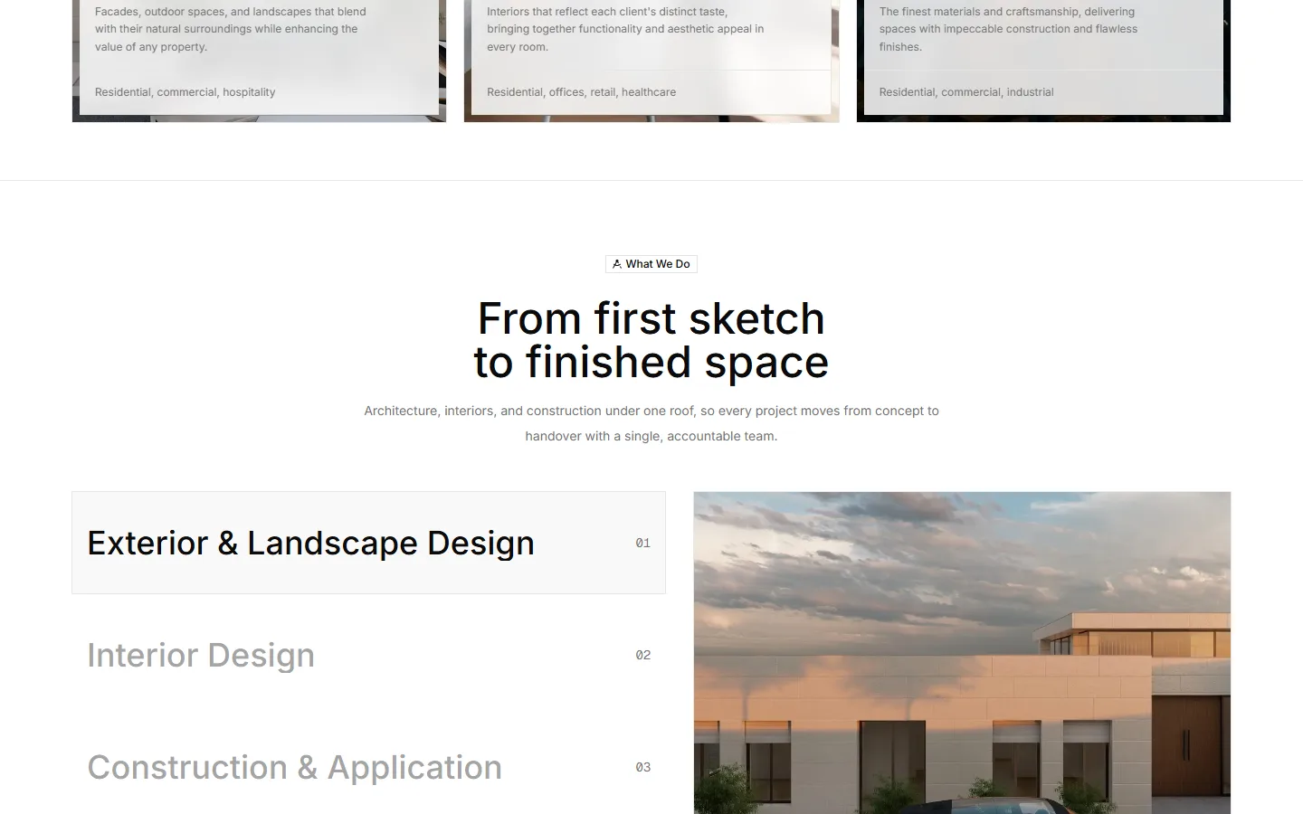
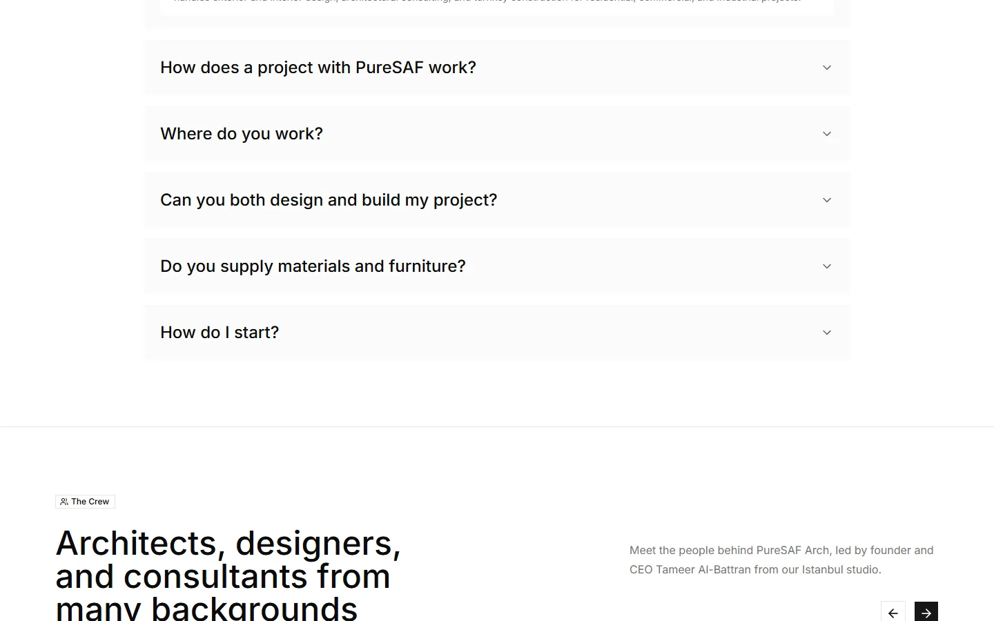
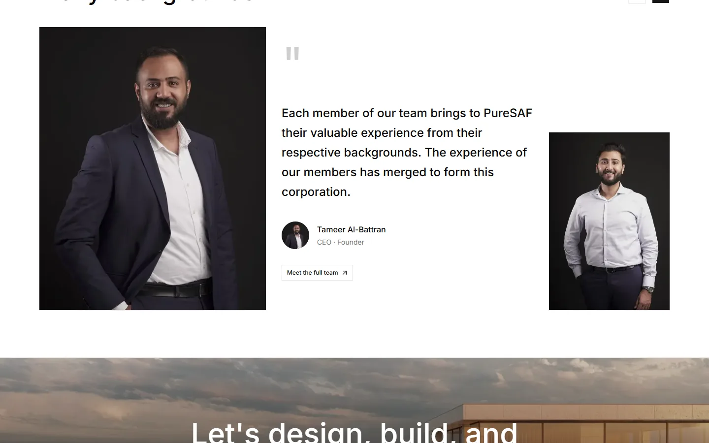
Direction B leads with a full-bleed render under a giant, translucent wordmark, a live service card and the three numbers a buyer looks for first. Then it walks the visitor down a guided page: a statement that reveals word by word, core services, a “first sketch to finished space” process, FAQ and the team.
It's warmer and more persuasive. It is also, unmistakably, a template: the structure could belong to any studio.
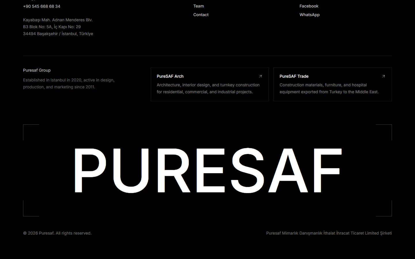
Direction B, top to bottom
/What each direction is good at
Side by side
A / Direction A
Editorial gallery
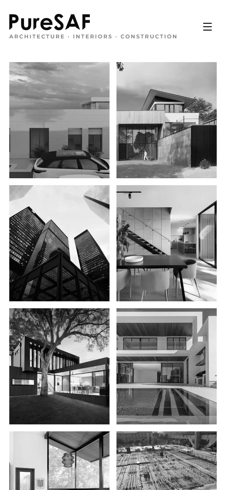
- Work-first: the portfolio is the pitch
- Grayscale wall reads as one body of work
- IA mirrors the practice: departments → projects
- Bilingual EN / AR as parallel columns
- Distinctive, but needs real photography to land
B / Direction B
Agency flow
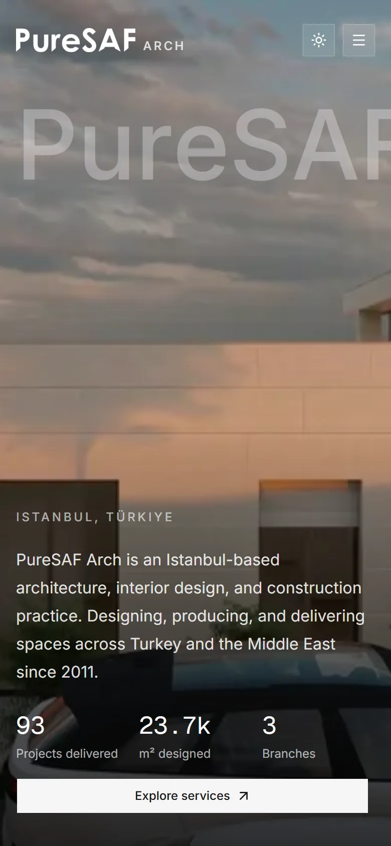
- Answers buyer questions in one scroll
- Numbers and services above the fold
- Motion-rich: reveals, accordion, carousel
- Works with today's limited photography
- Persuasive, but generic in structure
Decisions that carried across both
Content as data
Every page reads from typed files in lib/: departments, projects, team, contact. The client edits copy without touching layout, and both directions share one source.
Arabic is a column, not a toggle
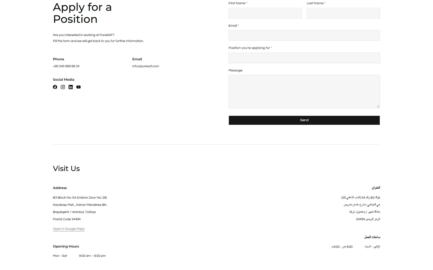
Gulf clients read both. Addresses and hours sit in EN and AR side by side, the Arabic set right-to-left with its own typographic rules.
WhatsApp first
The channel this audience actually answers. WhatsApp sits next to email and phone everywhere a visitor might want to talk.
Trade links out
The export business has different buyers. It's acknowledged in the IA and handed off to its own site rather than diluting the design story.
/Quiet on purpose
The system
Montserrat · Headings · 500–700
Architecture, Interiors & Construction
Questrial · Body & navigation · 11px nav at 0.18em
PROJECTS AND DEPARTMENTS
Cormorant Garamond · Italic · founder's voice only
“Unrivaled excellence is our promise to you.”
Everything
0px
- One accent, a muted steel blue, used in panels and focus states only.
- Square corners throughout: architecture drawings don't round their edges.
Information architecture (Direction A)
- 1
/
Home
Masonry gallery + clients strip. The work is the welcome.
- 2
/projects-and-departments
Departments
Architecture, Interior, Exterior & Landscape, Construction, Real Estate, Trade, Awards.
- 3
/[department]
Projects
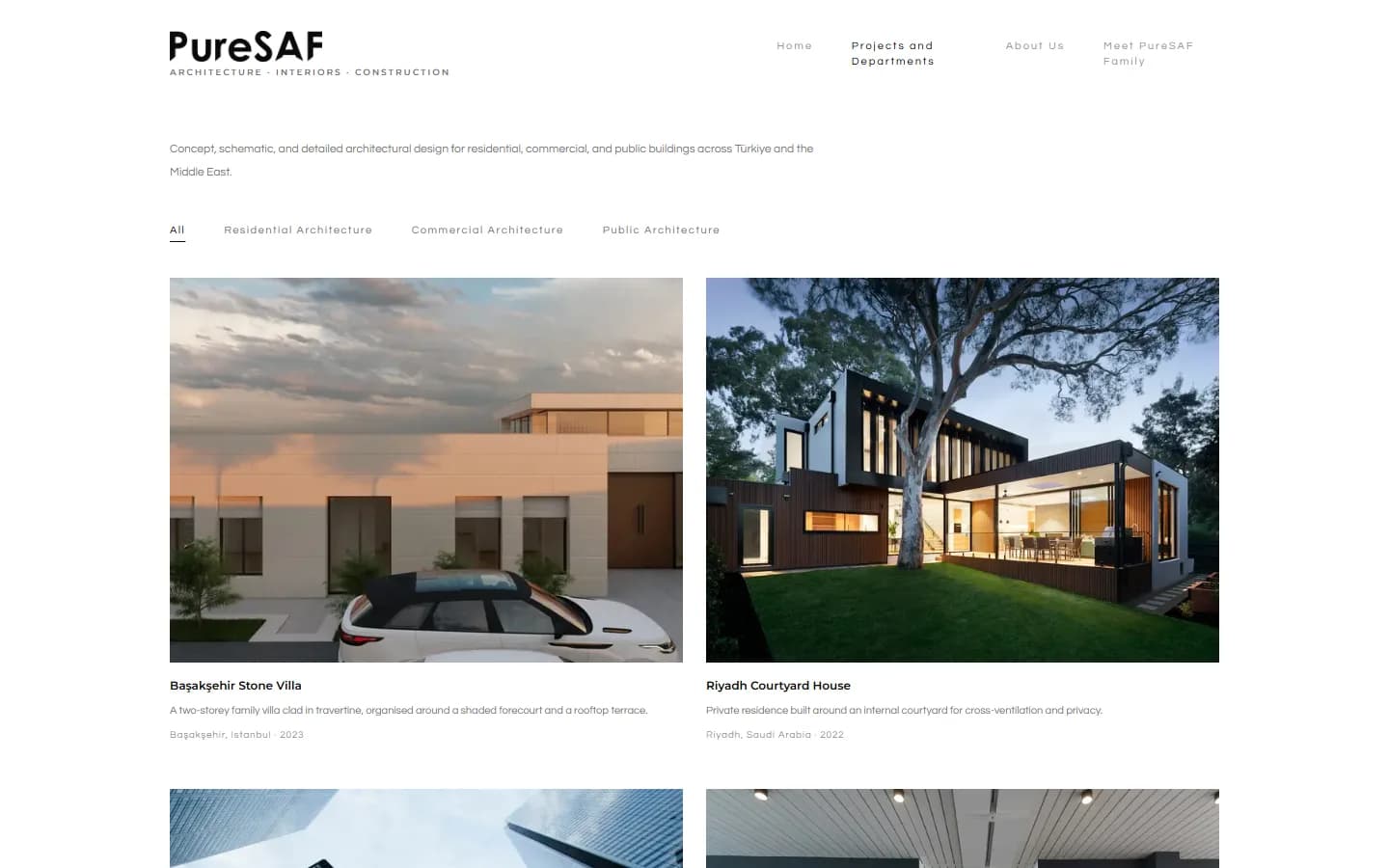
Filter tabs by category. Each tile opens its project.
- 4
/about-us · /meet-our-family
People
Founder story, quote, team grid with bios.
- 5
/contact
Contact
Job application, bilingual Visit Us, WhatsApp.
/Next: real photography
Where it landed
Project imagery, awards and client logos shown in the builds are placeholders pending the client's assets.
Both directions are fully built and deployable. Neither is finished until real project photography replaces the stock placeholders, and that single dependency shaped the recommendation: the gallery wins once the photos exist; until then, the agency flow carries the story with the one real render the practice has.
Because both share one content model, switching later is a deployment, not a rebuild.
Next / Mobile app · Website · Design system
Dolmapp